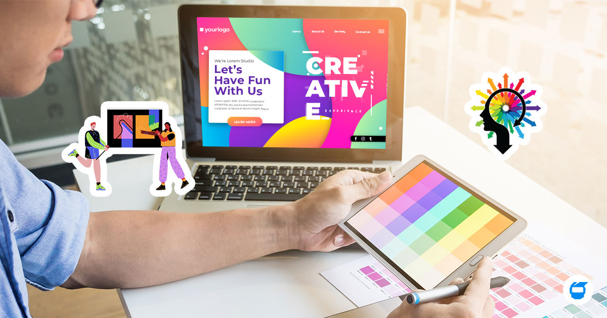
From layout to typography, every element contributes to the overall user experience when it comes to web design. However, one often underestimated aspect that significantly influences user perception is color psychology. Simply put, colors have the power to evoke emotions, convey messages, and shape user behavior.
With that, let’s look into the role of color psychology in web design and how it can be leveraged to create compelling online experiences.

Table of Contents
- What is Color Psychology?
- The Role of Color Psychology in Web Design
- Benefits of Incorporating Color Psychology in Web Design
- Colors and Meanings in Web Design
What is Color Psychology?
Color psychology is the study of how different colors affect our emotions, behaviors, and perceptions. It explores the idea that certain colors can evoke specific feelings or reactions in people. For example, warm colors like red or orange might make us feel passionate and warm, while cool colors like blue or green might make us feel calm and balanced.
The Role of Color Psychology in Web Design
1. Establishing Brand Identity
Colors play a crucial role in establishing brand identity and recognition. Think about iconic brands like Coca-Cola with its vibrant red hue. Consistent use of colors across a website reinforces brand identity and fosters brand recall.
Related: What is Brand Identity? Its Importance and Ways to Build a Successful Brand
2. Enhancing User Experience
Incorporating color psychology web design can enhance the user experience by guiding users through the website’s interface. For instance, using contrasting colors for call-to-action buttons makes them more noticeable and encourages user engagement. Similarly, color-coded navigation menus help users intuitively find their way around the site.
3. Communicating Messages
It can be used to communicate messages and evoke specific associations. For example, a health and wellness website might use shades of green to convey freshness and vitality, while a luxury brand might opt for sophisticated hues like gold or silver to denote exclusivity and prestige. This way, users can better understand or at least have an idea of the nature of the brand.
4. Emotional Impact
The use of color psychology helps designers evoke specific emotions in website visitors. By choosing colors carefully, designers can create a website atmosphere that aligns with the intended emotional response.
In the context of web design, color choices can shape how users perceive a website. For example, warm colors like red and orange often evoke feelings of energy and excitement, while cool colors like blue and green tend to convey a sense of calm and trustworthiness. By strategically using colors, designers can influence how users feel and interact with a website.
5. Navigation and Usability
Colors aid in navigation and enhance usability by distinguishing different sections or functions of a website. Well-chosen colors make it easier for users to find what they’re looking for and navigate the site efficiently.
Benefits of Incorporating Color Psychology in Web Design
1. Better User Experience
It may sound repetitive, but we can’t emphasize enough how the ‘simple’ color can benefit your web design – and as mentioned above, it’s one of the key roles of color psychology in web design. Simply understanding how colors affect users can help designers create websites that are visually appealing and easy to use, leading to a more enjoyable browsing experience.
2. Increased Brand Recognition
Consistent use of colors that reflect your brand identity helps reinforce brand recognition and makes your website memorable to visitors.
3. Improved Engagement and Conversion Rates
Strategic use of colors can guide users’ attention to important elements like calls-to-action, leading to higher engagement and conversion rates.
4. Cultural Sensitivity and Inclusivity
Considering cultural differences in color associations ensures that your website resonates positively with diverse audiences, encouraging inclusivity and avoiding potential cultural misunderstandings.
5. Data-Driven Optimization
Testing and refining color choices based on user feedback and analytics help optimize website performance and achieve business objectives.
Colors and Meanings in Web Design
Understanding color psychology empowers web designers to create visually appealing, emotionally resonant, and user-friendly websites that effectively communicate messages and achieve their objectives.
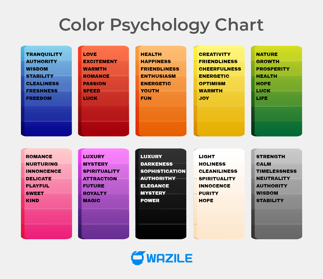
● Red
Often associated with passion, energy, and urgency. The color red can stimulate appetite and encourage action.
- When to Use: Use red for elements that require immediate attention, such as sale banners or important alerts.
- When not to Use: Avoid using red in contexts where you want to convey calmness or relaxation, such as meditation websites.
● Blue
Evokes feelings of trust, stability, and tranquility. It’s commonly used by businesses to convey professionalism and dependability.
- When to Use: Use blue for corporate websites, financial institutions, or healthcare services to convey trust and reliability.
- When not to Use: Avoid using blue in contexts where you want to convey excitement or energy, such as event promotions.
● Yellow
Symbolizes optimism, creativity, and friendliness. It can grab attention but should be used sparingly to avoid strain.
- When to Use: Use yellow for call-to-action buttons or highlighting important information to grab attention.
- When not to Use: Avoid using yellow in contexts where you want to convey seriousness or professionalism, such as legal or financial websites.
● Green
Represents growth, nature, and hope. It’s often used in environmental or health-related websites.
- When to Use: Use green for eco-friendly products, wellness centers, or gardening websites to convey a sense of harmony and freshness.
- When not to Use: Avoid using green in contexts where you want to convey urgency or excitement, such as limited-time offers.
● Orange
Combines the energy of red and the cheerfulness of yellow. It can create a sense of enthusiasm, happiness, and energy.
- When to Use: Use orange for call-to-action buttons or to highlight key features or promotions.
- When not to Use: Avoid using orange in contexts where you want to convey a sense of calmness or sophistication, such as financial or legal services.
● Purple
Signifies luxury, attraction, and spirituality. It’s often used in industries related to beauty, art, or wellness.
- When to Use: Use purple for luxury brands, creative agencies, or spirituality-related websites.
- When not to Use: Avoid using purple in contexts where you want to convey affordability or accessibility, such as budget-friendly stores.
● Pink
Pink evokes femininity, sweetness, and playfulness. It’s often used in beauty, fashion, or wellness websites to add a sense of softness and compassion. Vibrant shades can also infuse energy and excitement.
- When to Use: Ideal for female-targeted websites or brands aiming for warmth and personality.
- When not to Use: Avoid in contexts needing masculinity or seriousness, such as professional settings or sites targeting male audiences.
● Black
Associated with sophistication, elegance, and authority. It can create a sense of mystery and formality.
- When to Use: Use black for luxury brands, fashion websites, or professional services to convey elegance and authority.
- When not to Use: Avoid using black in contexts where you want to convey vibrancy or youthfulness, such as children’s websites.
● White
Symbolizes purity, cleanliness, and simplicity. It’s commonly used as a background color to create a sense of spaciousness and clarity.
- When to Use: Use white as a background color to make other elements stand out, such as product images or text.
- When not to Use: Avoid using white in contexts where you want to convey creativity or energy, such as art or entertainment websites.
● Gray
Gray is versatile, conveying neutrality and timelessness. It’s commonly used as a background color to highlight other elements. Use it to create a modern and professional aesthetic, but avoid overuse to prevent dullness.
- When to Use: As a background for a clean and elegant look. Also suitable for text and interface elements for readability.
- When not to Use: Excessive use may lead to a lack of energy, unsuitable for contexts needing vibrancy.
Start your project today! Get a free web design quote now!