
How to Create a High-Converting Landing Page: Tips and Best Practices
When someone clicks your ad, social post, or email link, they’re already interested, but what happens next depends on how your landing page performs. A strong design can turn that click into a loyal customer, while a weak one can make them bounce faster than you can say “limited offer.” That’s why your landing page plays such a big role in turning interest into action. It’s not just about looking good, it’s about guiding visitors toward a single, clear goal.

Table of Contents
- What Is a Landing Page and Why It Matters
- Landing Page vs. Website Homepage
- Types of Landing Pages and When to Use Them
- Key Elements and Layout of a High-Converting Landing Page
- Why a Strong Call-to-Action (CTA) Is Crucial for Landing Page Conversions
- Call-to-Action (CTA) Best Practices to Boost Landing Page Conversions
- Common Mistakes to Avoid on a Landing Page
- Landing Page Analytics and Metrics to Track for Better Conversions
- How to Increase Landing Page Conversions
- Landing Page Optimization: Turning Clicks Into Conversions
What Is a Landing Page and Why It Matters
A landing page is a standalone web page designed with a single goal: to get your visitors to take one specific action. Unlike your homepage, which gives a broad overview of your business, a landing page is laser-focused on one offer — whether it’s a free trial, newsletter signup, webinar registration, or product purchase.
Related: What is a Landing Page? Why Your Business Needs One
Knowing what makes a good landing page is key because it sets the foundation for all design and content decisions. A focused page keeps users from getting distracted and increases the chances of conversion.
Landing Page vs. Website Homepage
A common mistake in digital marketing is treating a landing page like a homepage, but they serve very different purposes.
- Your homepage acts as your brand’s welcome mat. It introduces your business, shows what you offer, and lets visitors explore different pages.
- A landing page, on the other hand, is built for one specific goal, such as getting people to sign up, buy, or download something. It is focused and direct.
If you want to increase landing page conversions, remove any distractions. Avoid extra links, side menus, or multiple CTAs. Keep one clear message and one action you want visitors to take.
Types of Landing Pages and When to Use Them
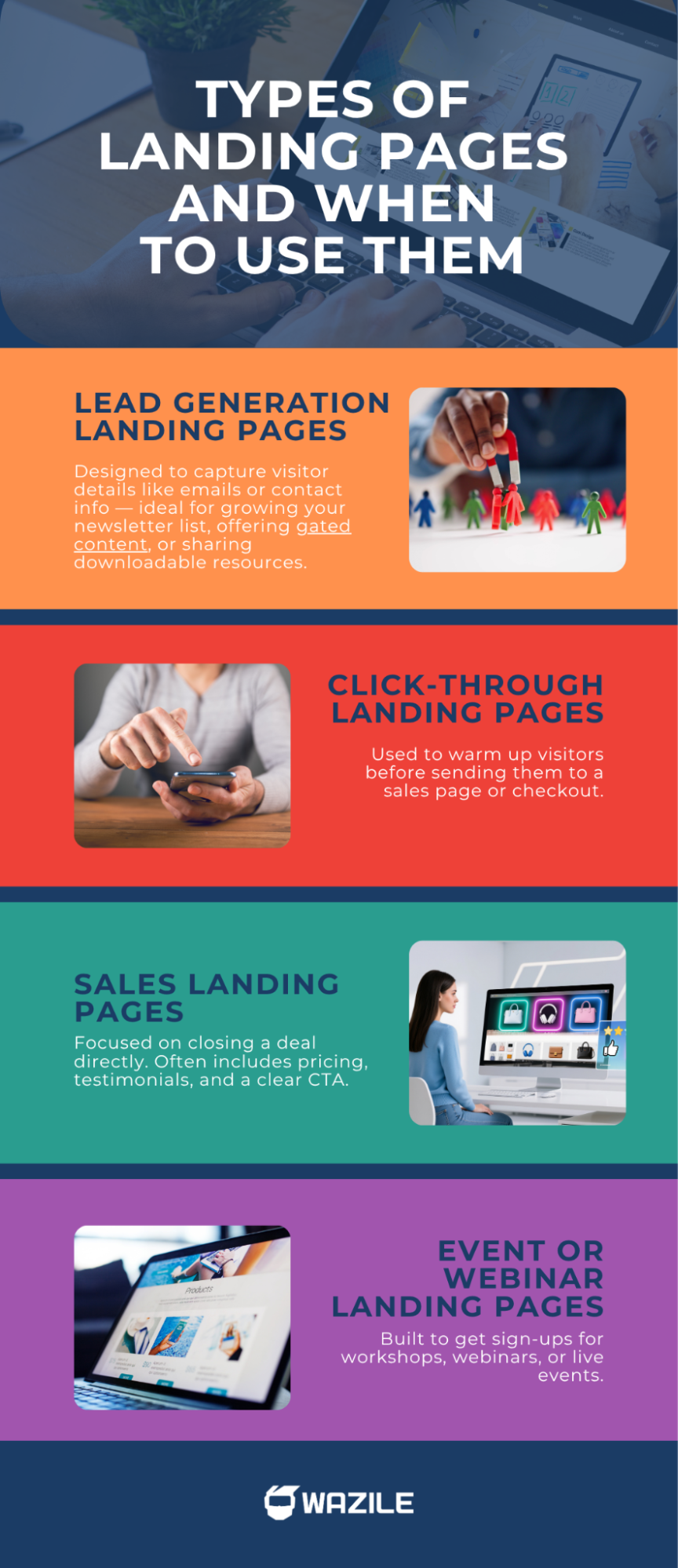
Not all landing pages are created equal. Here are the most common types you might need:
● Lead Generation Landing Pages
Designed to capture visitor details like emails or contact info — ideal for growing your newsletter list, offering gated content, or sharing downloadable resources.
● Click-Through Landing Pages
Used to warm up visitors before sending them to a sales page or checkout.
● Sales Landing Pages
Focused on closing a deal directly. Often includes pricing, testimonials, and a clear CTA.
● Event or Webinar Landing Pages
Built to get sign-ups for workshops, webinars, or live events.
By knowing the type of page you need, you can better plan its layout, copy, and CTA strategies to boost engagement.
Key Elements and Layout of a High-Converting Landing Page
A high-converting landing page isn’t about fancy animations — it’s about clarity, focus, and persuasion. Every part of your page should guide visitors toward one goal: taking action.
Here’s how to design a landing page layout that converts:
1. Attention-Grabbing Headline and Subheadline
Your headline should instantly tell visitors what they’ll get. Follow it with a supportive subheadline that reinforces your message or unique selling point (USP).
Example: “Get More Leads in Less Time — Without Spending Extra on Ads.”
2. Compelling Visuals
Use a hero image or short video that showcases your offer in action. Visuals help users connect emotionally and understand your product faster than text alone.
3. Clear Value Proposition and Benefits
Focus on what users gain, not just features. Use bullet points to highlight the key benefits like faster results, more convenience, and better savings.
4. Trust-Building Elements
Social proof matters. Add testimonials, ratings, case studies, or brand logos to show credibility and reduce hesitation.
5. Strong Call-to-Action (CTA)
Your CTA should be clear, bold, and action-driven. For example: “Start My Free Trial” or “Get Instant Access.” Use contrasting colors and repeat it strategically throughout the page.
6. Simple, Focused Layout
Keep distractions to a minimum. Avoid extra navigation links or unrelated buttons. The design should guide visitors naturally toward your main conversion goal.
7. Mobile-Friendly Design
Over half of web traffic comes from mobile, so make sure your layout is responsive, such as your text, visuals, and CTA should adjust seamlessly across devices.
Why a Strong Call-to-Action (CTA) Is Crucial for Landing Page Conversions
Your call-to-action (CTA) is what turns a visitor into a lead or customer. Even with great design and copy, a weak button or message can kill conversions. It’s not just about saying “click here”; it’s about using clear, benefit-driven language that shows what users will gain.
A strong message answers: “What’s in it for me?” Phrases like “Get My Free Trial” or “Start Saving Today” highlight value and make the action more enticing.
Keep it easy to spot, visually distinct, and repeat it across the page, ideally above the fold and near the end. Experiment with different colors, placements, and wording—small adjustments can lead to big jumps in conversions.
Call-to-Action (CTA) Best Practices to Boost Landing Page Conversions
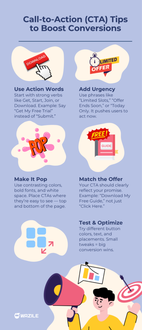
1. Use Action-Oriented Language
Your CTA should inspire immediate movement. Start with strong verbs like “Get,” “Start,” “Claim,” “Join,” or “Download.” Instead of saying “Submit,” say “Get My Free Trial” — it’s more personal and engaging.
2. Create a Sense of Urgency
Add time-sensitive phrases such as “Today Only,” “Limited Slots Available,” or “Offer Ends Soon.” Urgency encourages visitors to act now rather than later.
3. Make Your CTA Visually Stand Out
Your button should pop off the page. Use contrasting colors, white space, and bold fonts to make it easy to spot. Don’t make users search for it — your CTA button should always be visible above the fold and again near the bottom of the page.
4. Align Your CTA With Your Offer
The wording of your CTA should match your promise. If your offer is a free guide, your button could say “Download My Free Guide” — clear, specific, and value-driven.
5. Test Different Variations (A/B Testing)
Small changes can lead to big results. Experiment with button color, size, text, and placement to see what performs best. This falls under conversion rate optimization (CRO) — the process of improving your page for higher conversions.
Common Mistakes to Avoid on a Landing Page
Even a well-designed landing page can fail to convert if it has the wrong elements or too much going on. Avoid these common mistakes to keep your conversions high and your visitors engaged:
1. Too Many Distractions
When a landing page does too much, it loses focus. Too many offers, links, or pop-ups can confuse visitors and distract them from your goal. Keep the layout clean, the message clear, and make sure everything points to one main call-to-action (CTA).
2. Weak or Confusing Headlines
Your headline is the first thing people see, and you only have a few seconds to grab their attention. A vague or generic headline won’t stop them from scrolling away. Instead, make it specific and benefit-driven to tell visitors exactly what they’ll gain.
For example, “Boost Your Sales in 30 Days” is much stronger than “Learn More About Our Services.”
3. Vague Call-to-Action (CTA)
Phrases like “Click Here” or “Submit” don’t tell users what’s in it for them. Your CTA should clearly explain the benefit of taking action.
Try something like “Get My Free Demo,” “Start Saving Today,” or “Join the Free Workshop.” The more specific your CTA, the better your chances of getting clicks.
4. Ignoring Mobile Optimization
Over 62% of global web traffic now comes from mobile devices, according to recent data. So if your landing page isn’t mobile-friendly, you risk losing the majority of your visitors—due to slow loading, awkward layouts, or buttons that are hard to tap.
5. No Trust Signals
People hesitate to act if they don’t trust your brand. Adding reviews, testimonials, security badges, or brand logos helps reassure visitors that your offer is legitimate and safe. Even a simple statement like “Trusted by 5,000+ users” can make a big difference.
Landing Page Analytics and Metrics to Track for Better Conversions
1. Conversion Rate
This measures how many visitors complete your goal, like signing up or buying. A low rate means your page or CTA needs tweaking. Test different headlines, offers, or button placements to boost results.
2. Bounce Rate
Bounce rate shows how many visitors leave without doing anything. A high rate may mean your page loads slowly or the offer isn’t clear. Simplify your design and strengthen your message.
3. Time on Page
This shows how long visitors stay. If they leave quickly, your content might not be engaging enough. Improve visuals, layout, or copy to keep them interested.
4. Traffic Sources
See where visitors come from — social media, email, ads, or search. Focus on the channels that bring the most qualified leads to maximize conversions.
5. Heatmaps and User Behavior Tools
Tools like Hotjar or Microsoft Clarity show where users click or stop scrolling. Use these insights to refine your layout and place CTAs where they get the most attention.
How to Increase Landing Page Conversions
Lastly, focus on improving results over time:
- Personalize the experience based on traffic source.
- Highlight user pain points and how your offer solves them.
- Use scarcity and limited-time offers to encourage action.
- Incorporate testimonials and case studies for social proof.
Small, consistent improvements lead to higher ROI and long-term success.
Landing Page Optimization: Turning Clicks Into Conversions
Building a high-converting landing page is all about strategy, clarity, and consistent improvement. Keep your message sharp, your CTAs strong, and your design simple yet engaging.
Once you fine-tune these elements, you’ll start seeing more clicks turn into real conversions and gain more value from every campaign you launch.
Need help creating a landing page that converts? Hire a professional web designer today.