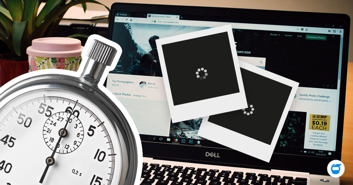
When downloading something off the internet, have you ever clicked on a download button that turned out to be an ad and led you to another site? If yes, then you’ve been victimized by a dark pattern. Dark patterns are elements of manipulative interface designed to trick users into taking action that they may have done freely.
These are tricks used in websites and applications (even in mobile), that make you buy or sign up for things that you did not mean to. Anyone can be tricked by dark patterns.
Dark Patterns is founded by a user experience designer with a PhD in cognitive science, Harry Brignull. According to his words, the website is dedicated to “naming and shaming websites that use deceptive user interfaces.”
In this article, we’ll be listing down different dark patterns that you have to look out for.
1. Bait and Switch
This type of dark pattern tricks users to set out to do something, but during the process, something else happens. Users are not aware and were not expecting that an action would happen.
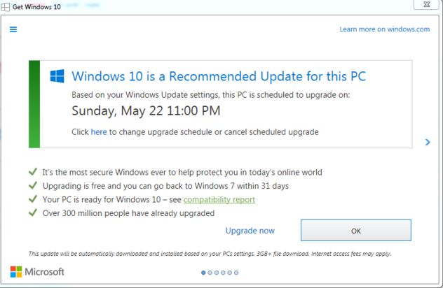
An example is Microsoft Windows 10’s update. Instead of closing the window, clicking the close button turns out to be the opposite. It meant as if you are agreeing to the upgrade.
2. Confirmshaming
You would often see it in sites wherein a small page pops up on your screen asking you to sign up for their subscription or service. But instead of having “no, thank you” as a no option, the option to decline turns out to be worded in such a way to shame the user.
In the photo above, instead of having a simple no as an option, they are shaming the user by the words that are on the no option. This can make some users feel guilt or shame at the same time.
3. Hidden Costs
When you get to the last step of your checkout, you discover some unexpected changes. They charge you with the delivery fees and taxes right at the last minute.

In these examples, the user started off by seeing that his total due is GBP 26.00, but as soon as he reached the final check out, it turned out that there are hidden charges such as the delivery charge.
Normally, stores would place a note saying that it’s not their final bill yet since there are some factors that would affect the fees such as delivery place or time. If there are any extra costs, they must be highlighted right away in their customer’s cart.
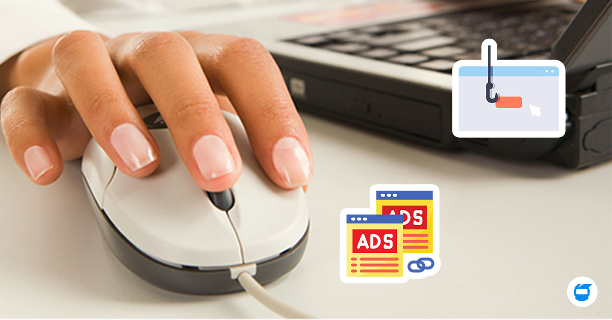
4. Disguised Ads
They are often found as download buttons in some websites. They are disguised as other kinds of content or navigation. These buttons are often advertisements that looks like download buttons which confuses the user.
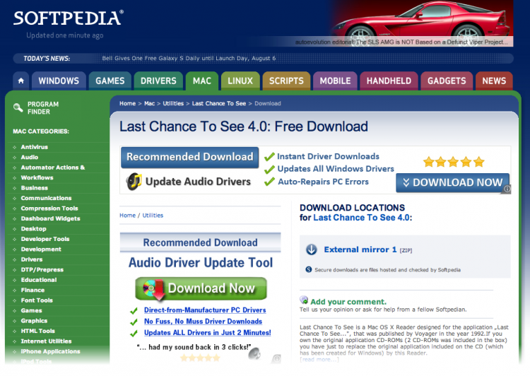
Here is another example. There are three download buttons on the photo, but as soon as you click on one of the three large download buttons, it will lead you to another website which is selling a product or service. The real download link is located at the right side which is named “External mirror 1.”
Don’t be fooled by these buttons. Try to check the link of the banners and also, don’t forget to look thoroughly into it. Google often labels these advertisements with a small information circle on the lower right of each banner.
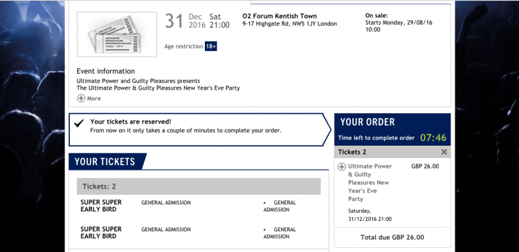
5. Forced Continuity
A user sees a sign-up for free trial or something only just to find themselves signing up into a paying scheme without prior warning or permission. They can also be disguised as banners or buttons. They are often not stated clearly, but just lures the user into continuing their transaction.
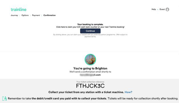
In this example, you can clearly see the continue button. Does that mean that once the user clicks the continue button, he will be directed to continue getting his ticket? No.
The user has already completed his booking by the time he reached that page and all he needs to do is to wait for a confirmation code in his e-mail. The continue button lures the user to look like he has to continue on “booking” his train ride which would lead him into paying something more than just the ride.
6. Roach Motel
This is a user experience technique in which users can easily get into a certain situation, but will then intentionally give them a hard time cancelling their account.
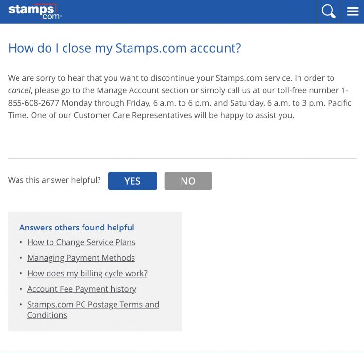
One example is this photo above. Instead of having your account closed right away, you have to call their customer support so they can close it for you. If you tried closing your Amazon account, you will be led to different options and at the end, you won’t be able to close your account on your own. You will have to chat with their customer live support as well and they will be closing it for you.
7. Sneak into Basket
As you purchase something, the site sneaks an additional item into your basket. Sometimes, when having to take the item off your cart, you have to go to a specific page to remove that item.
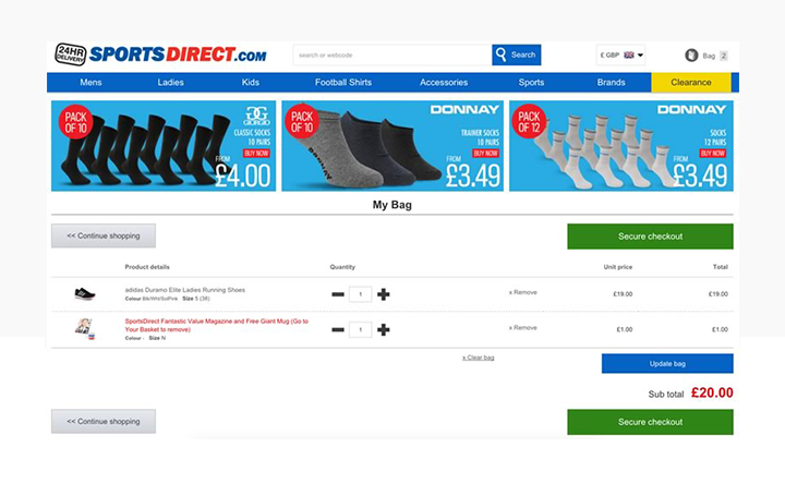
In this example, the site has sneaked a magazine with a free mug that costs $1.00. In order for the user to remove the item, the user has to go to his basket, just to remove the item.
8. Trick Questions
These are questions that when you looked upon quickly, it asks one thing, but once you read it carefully, it entirely says another thing. This is very common when signing up or registering in some websites.
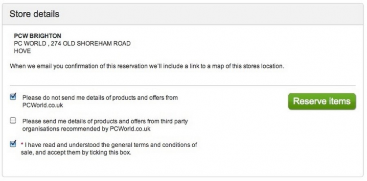
We usually tick those boxes when we agree to their terms and conditions or if we subscribe to their emails. But in this photo, it says that once the user ticks the box, the site will not send details of products and offer to the user’s email. If the user fails to tick that box, then, he will start receiving emails from the said website.
Dark Patterns can be simply spotted. An important reminder is to read everything carefully when signing up for services and when buying and something online. These can be tricky and even some of them will cost you for something you do not intend to pay for.
Looking for web design and development services in the Philippines? Contact us today and we’ll be glad to help you!