
What Is Mobile-First Design? A Guide to Optimizing Mobile User Experience

We’ve all opened a website on our phones, struggled to read the text or tap a button, and closed it almost instantly. That frustration is exactly why mobile-first design exists.
Today, most people browse, compare services, and make buying decisions using their smartphones. For many businesses, mobile isn’t just another screen size—it’s the first touchpoint. If your website doesn’t perform well on smaller devices, you’re likely losing potential customers before they even get to know your brand.
So what is mobile-first design, and why has it become such a big deal?
In this guide, we’ll break down what it means, how it connects to mobile-first indexing and search engine optimization (SEO), and the practical steps you can take to improve your mobile user experience without overcomplicating your website.
Table of Contents
- What Is Mobile-First Design?
- Why Mobile-First Design Matters for SEO and User Experience
- Mobile-First vs Responsive Design: What’s the Difference?
- Core Principles of Mobile-First Design
- How to Implement Mobile-First Design on Your Website
- Common Mobile-First Design Mistakes to Avoid
- The Bigger Picture: Mobile-First Is a Smart Business Decision
- Final Thoughts: Should You Go Mobile-First Design?
What Is Mobile-First Design?
Mobile-first design is a web design approach where you design for smaller screens first (like smartphones) before adapting the layout for tablets and desktops.
Instead of shrinking a desktop website to fit mobile screens, you start with the essentials—content, navigation, functionality—and then scale up.
In other words, mobile isn’t an afterthought. It’s the foundation.
When people search for “what is mobile-first design”, they’re usually trying to understand how it differs from traditional design. Traditionally, websites were built for desktop users, and mobile layouts were adjusted later. Today, that order has flipped.
Why? Because user behavior has changed.
More than half of global web traffic now comes from mobile devices. If your website doesn’t prioritize mobile usability, you’re automatically behind.
Why Mobile-First Design Matters for SEO and User Experience
Mobile-first design is no longer just a trend—it’s a practical response to how people actually use the internet today. When your website prioritizes mobile users, both your search visibility and overall user experience improve.
Let’s break down why that matters.
1. It Aligns With Mobile-First Indexing
Google now uses mobile-first indexing, which means it primarily evaluates the mobile version of your website when determining rankings. If your mobile layout lacks content, loads slowly, or offers a poor experience, your search performance can decline—even if your desktop version looks polished.
Because of this shift, improving your mobile experience directly supports your search engine optimization (SEO) efforts. A well-structured mobile site makes it easier for search engines to crawl, understand, and rank your content.
2. It Improves Engagement and Reduces Bounce Rates
User experience plays a huge role in whether visitors stay or leave. When your website is easy to navigate on a phone, users are more likely to explore multiple pages, read your content, or complete a form.
Related: What is User Experience (UX) Design? How to Design an Engaging Website User Experience?
On the other hand, cramped layouts, tiny buttons, and slow loading times push people away quickly. Since attention spans are shorter on mobile, even small usability issues can lead to lost opportunities.
3. It Enhances Page Speed and Performance
Mobile-first design encourages simplicity. By focusing only on essential content and features, websites tend to load faster and function more smoothly.
Faster loading times benefit both users and search engines. Google considers speed as part of its ranking factors, especially for mobile results. So when you optimize performance, you’re improving both visibility and experience at the same time.
4. It Leads to Higher Conversions
When users can easily browse your services, understand your message, and take action without friction, conversions increase naturally. Whether that action is making a purchase, booking a service, or submitting an inquiry form, clarity makes the difference.
A mobile-first approach removes unnecessary distractions and highlights what truly matters. That focus guides users toward decisions instead of overwhelming them.
Mobile-First vs Responsive Design: What’s the Difference?
This is one of the most common questions in web design—and honestly, it can get confusing fast. The terms are often used interchangeably, but they’re not the same.
Let’s simplify it.
Mobile-First Design
With mobile-first design, you start by designing for smartphones. Once the mobile layout is finalized, you expand the design for tablets and desktops.
That means you focus on:
- The most important content first
- Simple and clear navigation
- Fast-loading, lightweight pages
Because mobile screens are smaller, you’re forced to prioritize what truly matters. There’s no room for clutter. As a result, the final website usually feels cleaner and more focused across all devices.
Responsive Design
Responsive design, on the other hand, means your website automatically adjusts to different screen sizes. Whether someone views it on a phone, tablet, or desktop, the layout adapts accordingly.
It’s flexible by nature.
However, here’s the key point: responsive doesn’t always mean mobile-first.
A site can be built for desktop first and still be responsive. In that case, the mobile version may simply be a compressed version of the desktop layout—not necessarily optimized for smaller screens.
So What’s the Real Difference?
When looking at mobile-first and responsive approaches, the main difference is in their overall strategy.
- Responsive design is about adaptability.
- Mobile-first design is about priority.
One ensures your site fits different screens. The other ensures mobile users come first from the very beginning.
If you’re thinking long-term—especially when considering performance, SEO, and user behavior—the mobile-first approach in web design often delivers better results. It encourages simplicity, faster load times, and a smoother experience overall.
In short, all mobile-first sites should be responsive. But not all responsive sites are truly mobile-first.
Core Principles of Mobile-First Design
Now that we’ve answered what mobile-first design is, let’s look at how to apply it.
Prioritize Essential Content
On mobile screens, space is limited. You don’t have room for clutter.
Start with:
- Clear headlines
- Concise descriptions
- One strong call-to-action
If something isn’t important, remove it.
This mindset naturally improves usability across all devices.
Design for Touch, Not Clicks
Mobile users tap with their thumbs—not precise mouse pointers.
Buttons should:
- Be large enough to tap comfortably
- Have enough spacing between them
- Be placed within thumb-friendly zones
Ignoring this detail leads to frustration quickly.
Keep Navigation Simple
Complicated menus don’t work well on small screens.
Use:
- Hamburger menus
- Sticky navigation bars
- Minimal menu items
Clear pathways reduce confusion and improve engagement.
Optimize for Speed
Mobile users expect fast loading times. Slow websites lose traffic fast.
To improve mobile website optimization, focus on:
- Compressing images
- Reducing unnecessary scripts
- Enabling caching
- Using clean code
Page speed isn’t just about user experience. It’s also part of mobile SEO best practices.
Mobile UX Best Practices for a Better User Experience
Designing for mobile isn’t just about fitting a website onto a smaller screen. It’s about creating an experience that feels natural, intuitive, and enjoyable for mobile users. Here are practical mobile UX best practices that can make a real difference.
Use Readable Typography
Small, cramped text frustrates users instantly. Make sure your fonts are:
- Large enough to read without zooming
- High contrast for clarity
- Properly spaced between lines
Readable typography keeps visitors engaged and reduces bounce rates.
Simplify Forms
Long, complicated forms are a mobile user’s worst enemy. Only ask for essential information and use features like autofill and dropdowns to make filling out forms quick and painless. This approach improves conversions and overall user satisfaction.
Optimize Buttons and Touch Areas
Mobile users navigate with their thumbs, not a mouse. Buttons should be:
- Large enough to tap easily
- Spaced well apart to avoid accidental clicks
- Placed in areas easy to reach with a thumb
Ignoring these details can make a mobile site frustrating to use, even if it looks good.
Keep Navigation Simple
Complicated menus don’t work on small screens. Consider:
- Hamburger menus
- Sticky navigation bars
- Minimal, clear menu items
Simplified navigation guides users to what they need without confusion.
Reduce Load Times
Fast websites create happy users. To improve mobile website optimization:
- Compress images without losing quality
- Limit unnecessary scripts
- Enable caching and clean coding practices
Page speed also plays a big role in SEO, so faster sites benefit both users and search engines.
Related: What is Website Optimization? Benefits and Challenges
Avoid Intrusive Pop-Ups
Pop-ups that cover the entire screen frustrate users and can even hurt search rankings. Use subtle banners or timed messages instead to maintain engagement without interruption.
Test on Real Devices
Simulators are helpful, but nothing beats testing on actual phones. Check for:
- Button spacing
- Scroll behavior
- Page load speed
- Layout consistency
Real-world testing ensures your mobile-first design strategy works in practice, not just in theory.
How to Implement Mobile-First Design on Your Website
If you’re wondering how to take action, here’s a simple roadmap.
Step 1: Audit Your Current Mobile Experience
Open your site on your phone.
Ask yourself:
- Is everything easy to read?
- Does it load quickly?
- Are buttons easy to tap?
- Is navigation clear?
You can also use Google’s PageSpeed Insights (PSI) to check mobile performance.
Step 2: Redesign with Mobile Layout as the Base
When planning updates, design the mobile wireframe first.
Focus on:
- Essential content hierarchy
- Clear calls-to-action
- Simple navigation
From there, expand the layout for tablets and desktops.
Related: What is a Call to Action (CTA)? Why Every Website Needs One
Step 3: Optimize for Mobile SEO
Strong design alone isn’t enough. You also need to focus on mobile optimization for SEO.
Make sure:
- Mobile and desktop content match
- Metadata is consistent
- Structured data is intact
- Images are optimized
Following these mobile SEO best practices ensures you align with Google’s mobile-first indexing system. If you need expert guidance, investing in professional SEO services to improve search rankings can help you implement these strategies effectively and stay competitive.
Common Mobile-First Design Mistakes to Avoid
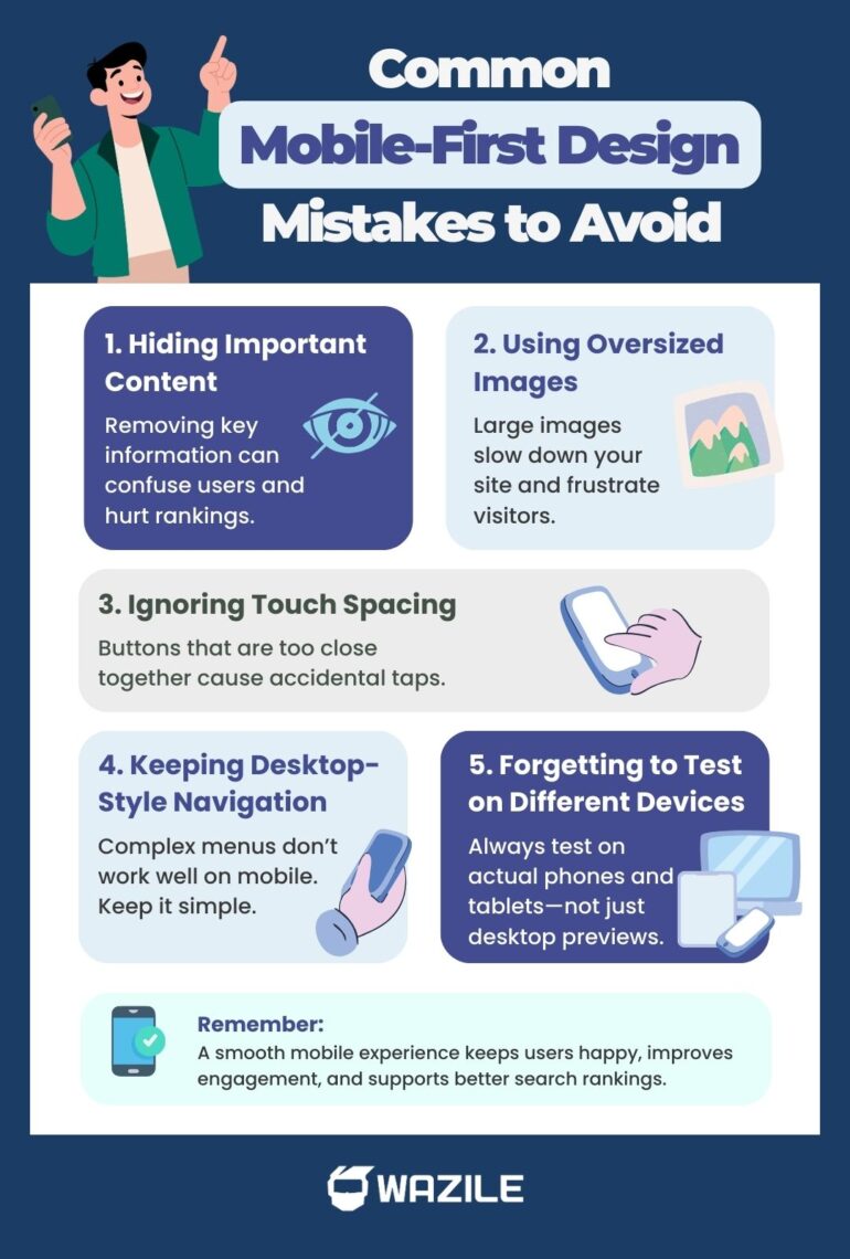
Even well-designed websites can run into mobile problems if you’re not careful. Recognizing common pitfalls helps you save time, improve usability, and protect your SEO. Here are the mistakes to watch out for:
● Hiding Important Content on Mobile
Some sites remove key content on smaller screens to save space. This can confuse users and hurt your rankings if Google can’t see the content.
● Using Oversized Images
Large, unoptimized images slow down load times, frustrating users and negatively affecting mobile SEO.
● Ignoring Touch Spacing
Buttons and links need enough space for thumbs. Crowded elements lead to accidental clicks and poor user experience.
● Keeping Desktop-Style Navigation
Menus designed for desktops often don’t translate well to mobile. Simple, thumb-friendly navigation is essential.
● Forgetting to Test Across Screen Sizes
Relying only on desktop previews or simulators can miss issues. Real-world testing on multiple devices ensures your mobile-first design actually works.
Avoiding these common mistakes strengthens your mobile-first strategy, improves user experience, and keeps your site performing well in search rankings.
The Bigger Picture: Mobile-First Is a Smart Business Decision
Mobile-first isn’t just a design trend—it’s a strategy that improves both user experience and search performance. Websites built with this approach are usually cleaner, faster, and more focused, which benefits all visitors, not just those browsing on smartphones.
Prioritizing mobile users also boosts engagement. When visitors can easily navigate your site, find the information they need, and interact with content, they’re more likely to stay longer and take action. The result? Higher conversions, better search visibility, and sustainable business growth.
In short, putting mobile users first isn’t only about design—it’s about creating a website that works seamlessly for users, ranks well in search results, and supports your long-term goals.
Final Thoughts: Should You Go Mobile-First Design?
If most of your traffic comes from mobile—and for most businesses, it does—the answer is simple: yes.
Mobile-first design helps you:
- Align with Google’s mobile-first indexing
- Improve user experience
- Increase engagement
- Support SEO performance
- Boost conversions
Instead of adjusting for mobile later, start there.
Because in today’s digital landscape, mobile isn’t secondary. It’s primary.
And if you’ve been asking what mobile-first design is and why it matters, now you know—it’s not just a design preference. It’s a smart strategy for visibility, usability, and long-term growth.
Don’t let poor mobile experience hold your business back. Work with a trusted web design company in the Philippines and build a site designed for performance, SEO, and growth.