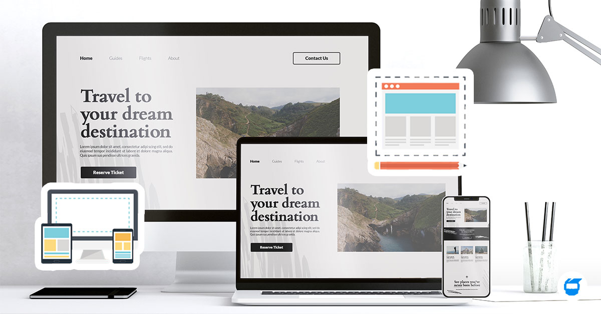
What Is Responsive Web Design? Crafting Sites for Every Screen Size
We access websites on a multitude of devices – from trusty desktop computers to smartphones, tablets, and everything in between. As a result, web designers have to tackle a fundamental challenge: making sure that websites look and function seamlessly on all these various screen sizes. This is where responsive web design comes into play. In this article, we’ll explore what responsive web design is, why it’s crucial, and how it works, offering valuable insights for both web designers and website owners.

Table of Contents
- What Is Responsive Web Design?
- Why Is Responsive Web Design Important?
- How Does Responsive Web Design Work?
- The Basics of Responsive Design
- Tips for Effective Responsive Web Design
What Is Responsive Web Design?
Responsive web design ensures that websites look great and function smoothly on any device, from desktops to tablets and smartphones. By using responsive web design for mobile users, your site automatically adapts to different screen sizes, providing an optimal experience no matter how visitors access it.
Related: What is User Experience (UX) Design? How to Design an Engaging Website User Experience?
Why Is Responsive Web Design Important?
Imagine this: you visit a website on your phone, and you have to pinch and zoom to read the text or navigate through the menu. Frustrating, right? A non-responsive website can deter visitors and harm your business. Here’s why responsive web design is a must:
1. It Results in Happy Users
A responsive site makes browsing a breeze, without needing to zoom in and out. This leaves users with a positive and satisfying experience on your website.
2. It’s Google-Friendly
Google loves responsive websites and ranks them higher in search results, helping users or potential customers easily find your website.
3. It’s Cost-Effective
It allows you to maintain a single website that adapts to all devices, eliminating the need for creating and managing multiple versions of your site, which can save you time and resources. Hence it’s a budget-friendly approach for ensuring your website looks and functions well on a variety of devices, from computers to smartphones.
4. It Helps Your Business
When your site is user-friendly, people are more likely to buy your products or use your services because they had a positive experience navigating through your website.
How Does Responsive Web Design Work?
Now, let’s dive into the nuts and bolts of how responsive web design operates.
1. Fluid Grids and Layouts
Responsive design relies on fluid grids and layouts. Instead of fixed pixel measurements, elements on the page are defined in relative units like percentages. This enables them to adapt to the screen size. For instance, a 50% width column will always take up half the screen’s width, whether it’s on a tiny smartphone or a large desktop monitor.
2. Flexible Images and Media
Images and media elements are adjusted through CSS to ensure they scale proportionally with the screen size. This keeps images from overflowing or appearing too small on different devices. Using the max-width property in CSS is a common technique to achieve this.
3. Media Queries
Media queries are a critical part of responsive web design. They enable you to apply different CSS styles based on the device’s characteristics, such as its width, height, and orientation. For instance, you can use a media query to change the font size or hide certain elements on smaller screens.
4. Mobile-First Approach
A mobile-first approach has gained prominence over the recent years. This means designing for mobile devices first, then progressively enhancing the layout for larger screens. By starting with the most constrained layout, you ensure that your website is efficient and effective on smaller screens.
5. Testing and Debugging
Responsive web design involves extensive testing and debugging to ensure that it works flawlessly across various devices and browsers. Tools like browser developer tools, emulators, and real device testing are essential for this process.
The Basics of Responsive Design
1. Flexible Grid Systems
Think of flexible grids like arranging furniture in your house. These grids help organize content neatly on a webpage. They adapt to different screens, making sure everything looks just right. Popular grid systems like Bootstrap and 960 Grid System make this easy.
2. CSS Media Queries
Same as with what was mentioned previously, media queries are like the secret sauce of responsive design. They are CSS rules that decide how a website looks on different screens. You can use them to make text bigger on small screens or hide things on mobiles to keep it tidy.
3. Flexible Images and Media
Images and videos need to be adjusted too. With CSS, you can make sure they always fit nicely on any screen. It’s like making sure your pictures and posters are never too big or too small.
Tips for Effective Responsive Web Design
1. Keep It Simple
Make the important stuff easy to find, especially on small screens.
2. Make It Fast
Speed things up by compressing images and making the site load quickly.
3. Easy to Tap
See to it that the buttons are big enough to tap on touchscreens. This is because small buttons may be annoying for some users, leading them to leave your website without pushing through any desired actions.
4. Test Extensively
Check how your site looks on different devices to make sure it works well for everyone.
5. Stay Updated
Don’t stop trying to improve your website. It’s always best to keep learning about new ways to make your website better for everyone.
Looking for responsive web design experts? Schedule a web design consultation now!