
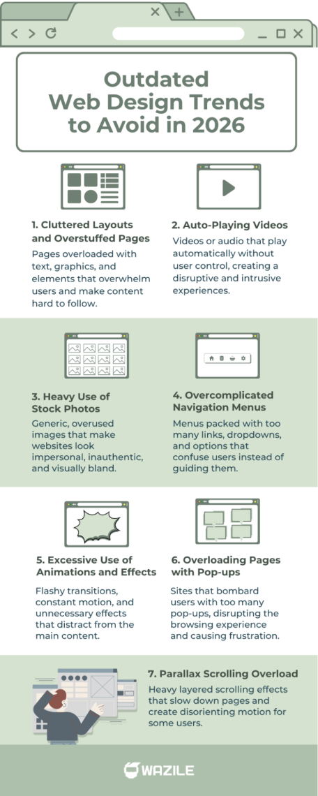
7 Outdated Web Design Trends to Avoid in 2026
The web design landscape is always evolving. What was cool and trendy a few years ago might now feel clunky or even drive visitors away. If you want your website to stay fresh, professional, and user-friendly, it’s crucial to know which outdated web design trends you should leave behind as we step deeper into 2026.
In this article, we’ll cover the biggest web design trends to avoid and explain why some common choices are now more harmful than helpful. Plus, I’ll share some tips on what to focus on instead to keep your site modern and engaging.

Table of Contents
- Cluttered Layouts and Overstuffed Pages
- Auto-Playing Videos
- Heavy Use of Stock Photos
- Overcomplicated Navigation Menus
- Excessive Use of Animations and Effects
- Overloading Pages with Pop-ups
- Parallax Scrolling Overload
- Wrapping Up: Avoid These Web Design Pitfalls
1. Cluttered Layouts and Overstuffed Pages
Remember when websites tried to cram as much info as possible “above the fold”? Flashy banners, tons of text, blinking icons—you name it. That’s an example of outdated web design trends that can overwhelm visitors.
Why it’s a mistake:
- Visitors scan rather than read every detail.
- Clutter makes it hard to find the main message or call to action.
- Slower load times from too many elements.
What to do instead:
Keep your pages clean and focused. Use whitespace to your advantage and highlight important info with clear headlines and buttons. Minimalism is still very much in style.
Related: Creating a Clean and Minimalist Web Design: A Step-by-Step Guide
2. Auto-Playing Videos
Back in the day, many sites thought auto-playing videos or background music were cool ways to grab attention. While having a video on your website is great for engagement, auto-playing ones are a classic web design trend to avoid because they often frustrate users and take control away from them.
Why it’s a mistake:
- Unexpected sounds can annoy or scare off visitors.
- It can slow down your site.
- It hurts accessibility and mobile user experience.
The better option:
Let users control their experience. If you want to add videos, keep them muted by default or provide a clear play button. This simple approach avoids the common drawbacks of autoplay videos and ensures visitors can engage with your content on their own terms.
3. Heavy Use of Stock Photos
Stock images used to be a lifesaver when you didn’t have custom photos. But the web is saturated with generic stock photos that feel impersonal and cheap. This is one of the common web design mistakes to avoid if you want your site to stand out, especially with the growing concerns about the SEO impact of stock photos on overall site performance.
Why it’s a mistake:
- Visitors often recognize overused stock photos.
- It doesn’t build trust or authenticity.
- It can make your brand look generic.
What works better:
Invest in authentic visuals. Use custom photography, illustrations, or even user-generated content to create a unique vibe.
4. Overcomplicated Navigation Menus
Mega menus with dozens of dropdown options might have seemed like a great way to offer every link at once. But this can confuse visitors and slow down decision-making.
Why it’s outdated:
- Visitors get lost or overwhelmed by too many choices.
- Poor navigation leads to high bounce rates.
- It’s harder to optimize for mobile.
How to fix it:
- Simplify your menu to the essentials.
- Group related pages logically and use clear labels.
- Consider mobile-friendly menus like hamburger icons.
5. Excessive Use of Animations and Effects
Subtle animations can enhance user experience, but going overboard with flashy effects, parallax scrolling, or blinking buttons is another outdated web design practice in 2026.
Why avoid this:
- Distracts visitors from your content.
- Can cause performance issues.
- May not work well on all devices.
Tip for modern design:
Use animations sparingly and purposefully to guide users or emphasize key actions.
6. Overloading Pages with Pop-ups
Pop-ups can be effective for capturing emails or promoting offers—but too many or poorly timed pop-ups are a major turn-off.
Why to avoid this trend:
- Interrupts user experience.
- Annoy visitors, leading them to leave immediately.
- Can hurt SEO if overused.
Related: What is SEO? A Handy Guide to Search Engine Optimization
How to use pop-ups wisely:
Limit frequency and timing. Offer clear value, like discounts or useful info, and make closing easy.
7. Parallax Scrolling Overload
Parallax scrolling had its time in the spotlight, adding a sense of depth that many designers loved. Today, the effect can still enhance a page, but relying on it too heavily often creates more problems than benefits. Large, layered animations can slow down loading times, strain older devices, and even trigger motion discomfort for some visitors.
Why it’s outdated:
- It increases load times and hurts performance.
- Not all devices handle the animation well.
- Can distract from core messaging and content.
The better approach:
Use parallax elements only when they add meaning—not just decoration. Keep movements subtle, clean, and minimal so your content stays front and center.
Wrapping Up: Avoid These Web Design Pitfalls
Keeping your website fresh means steering clear of these outdated web design trends. From cluttered layouts to ignoring mobile responsiveness, the mistakes above can drag down your site’s performance and reputation.
Remember, the best design is user-focused: clean, fast, accessible, and easy to navigate. By ditching these common errors, you’ll build a site that works better for visitors and ranks higher on search engines.
Ready to leave outdated web design trends behind? Upgrade your site with our affordable web design services in the Philippines today and start building a website that truly works for your brand.