
What is a Call to Action (CTA)? Why Every Website Needs One
If you’ve spent any time on a website, you’ve probably seen a Call to Action (CTA) — even if you didn’t know that’s what it was. Think: buttons like “Sign Up Now,” “Get a Free Quote,” or “Learn More.” Simple? Yes. But behind those few words is a powerful tool that can drive sales, grow email lists, boost engagement, and so much more.
In this article, we’ll break down what a call to action is, why it’s essential for your website, and how to make it work for your business — all in a friendly, straightforward way.
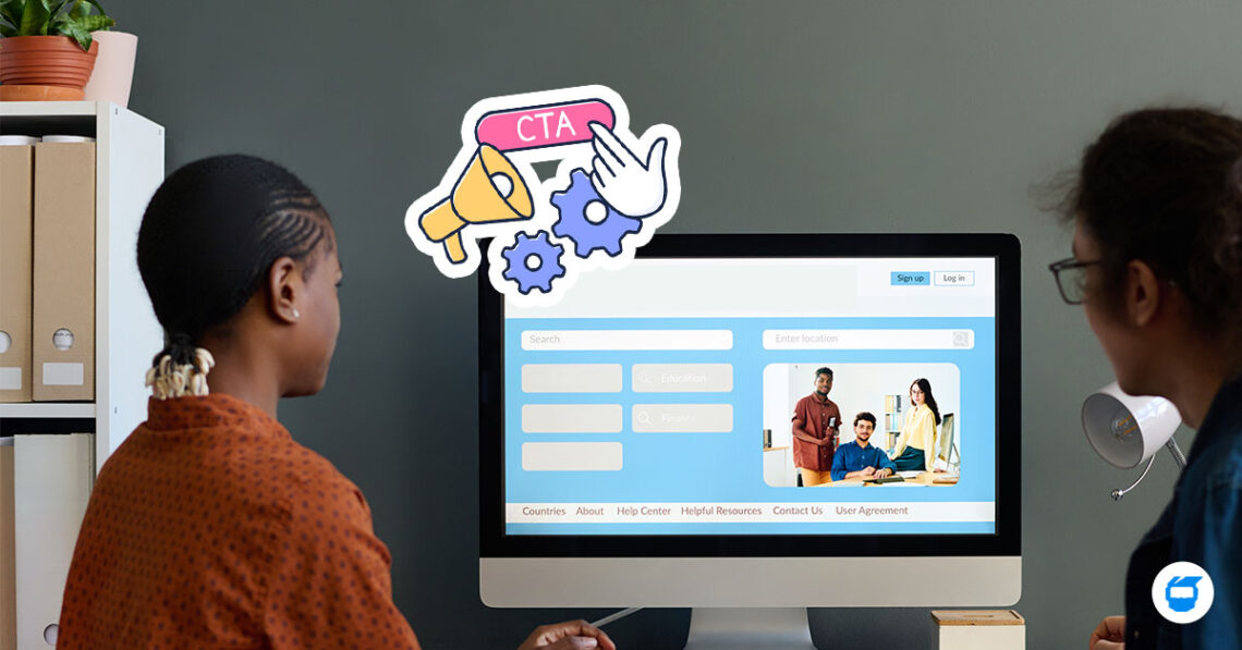
Table of Contents
- What Is a Call to Action (CTA)?
- Why Every Website Needs a CTA
- Types of Call to Action (CTA)
- What Makes a Good Call to Action?
- How to Write an Effective Call to Action
- Examples of Effective Website CTAs
- Common Call to Action Mistakes to Avoid
What Is a Call to Action (CTA)?
A Call to Action is a short, direct prompt on a website that encourages users to take a specific next step — whether that’s making a purchase, signing up for a newsletter, or downloading a resource. It’s typically written as a command or quick phrase, like:
- “Buy Now”
- “Subscribe”
- “Download the Guide”
- “Schedule a Free Demo”
In short, it guides visitors toward doing something valuable for your business — and hopefully useful for them, too. Think of it as your website’s way of saying, “Hey, here’s the next step.”
CTAs can come in the form of buttons, text links, banners, or even forms. They’re a key part of website development and professional web design because they help shape the user experience and boost your site’s performance.
Why Every Website Needs a CTA
No matter what your website is for — e-commerce, services, blogs, or portfolios — a website CTA plays a vital role. Here’s why:
1. CTAs Drive Conversions
Without a CTA, visitors might just browse and leave. A clear, clickable call to action like “Add to Cart” or “Book a Call” gives them a direction. Whether your goal is a sale, a download, or a sign-up, CTAs help make it happen.
2. They Improve User Experience
Visitors appreciate guidance — it’s a key part of great user experience (UX). A CTA tells them what to do next, which keeps them engaged, reduces confusion, and helps them move smoothly through your site. It’s like a helpful signpost that enhances usability and makes navigating your website easier and more intuitive.
3. CTAs Help You Measure Success
You can track how often people click your CTAs. This data shows what’s working — and what needs tweaking. With the right analysis tools, you’ll know which phrases, placements, and styles drive the most clicks.
4. They Support Your Marketing Goals
In digital marketing, a call to action often connects your website content to your larger marketing strategy. Whether you’re running ads, sharing blogs, or posting on social media, a strong call to action in marketing supports more effective digital marketing tactics and helps turn attention into action.
Types of Call to Action (CTA)
Not all CTAs are created equal. Here are some of the most common types:
1. Lead Generation CTAs
These are designed to collect contact information, like “Download Our Free E-Book” or “Join Our Mailing List.”
2. Sales CTAs
Think “Shop Now” or “Start Free Trial.” These encourage users to make a purchase or begin a buying process.
3. Engagement CTAs
These keep users on your site longer or encourage interaction, like “Watch the Video,” “Read the Full Post,” or “Leave a Comment.”
4. Social Sharing CTAs
Phrases like “Share This Post” or “Post on X (formerly Twitter)” help expand your reach beyond your website. Other examples include “Pin It,” “Post to LinkedIn,” “Send to a Friend,” or “Share on WhatsApp.” These CTAs encourage users to promote your content across different platforms, increasing visibility and driving more traffic back to your site.
What Makes a Good Call to Action?
A great CTA isn’t just about flashy buttons — it’s about clarity, timing, and psychology. Here’s what to aim for:
● Clear and Actionable Language
Use strong verbs and keep it short. “Start Now,” “View Sample,” or “Get My Free Trial” are great examples.
● Urgency and Relevance
Adding urgency like “Limited Time Offer” or relevance like “For Freelancers Only” can boost clicks. People respond to messages that feel personal and timely.
● Visible Placement
Don’t hide your CTA in a corner. Put it where it makes sense — above the fold, at the end of a blog post, or after a product description.
● Mobile-Friendly Design
Since many users browse on mobile, your call to action should be big enough to tap and easy to read on small screens.
How to Write an Effective Call to Action
If you want your CTA to do more than just sit there and look pretty, here are some useful tips to help you craft one that truly works:
1. Start with a Strong Verb
Use action-oriented words that push users to do something: “Download,” “Try,” “Book,” “Subscribe,” “Discover.” These create momentum.
2. Highlight the Benefit
Your call to action should be able to answer the user’s question: “What’s in it for me?” Instead of saying “Submit,” try “Get My Free Guide” or “Claim Your Discount.” It’s more enticing and benefit-focused.
3. Keep It Short and Clear
CTAs are not the place for long copy. Aim for 2–5 words. If needed, use a short sentence that’s scannable. Clear beats clever.
4. Create a Sense of Urgency
Phrases like “Limited Time Only,” “Offer Ends Soon,” or “Act Now” help motivate users to click rather than postpone.
5. Match the CTA to the Page’s Purpose
If someone is reading a blog post, a soft CTA like “Learn More” or “Download the Free Guide” works better than “Buy Now.” Make sure to align the task with where they are in the funnel.
6. Test and Tweak
Sometimes, small changes can lead to big results. Try A/B testing your CTA text, button colors, or placement to see what gets the most clicks.
Examples of Effective Website CTAs
To give you some ideas, here are a few CTAs you can test or adapt:
- “Start My Free Trial” – Perfect for apps or online tools that offer a limited-time free version before asking users to pay, like streaming services, design software, or productivity platforms.
- “Get Instant Access” – Creates urgency.
- “Get a Free Quote” – Ideal for service-based businesses, and encourages users to ask about pricing without commitment.
- “Book a Free Consultation” – Popular for service-based businesses.
- “Download the Guide Now” – Perfect for lead generation.
Common Call to Action Mistakes to Avoid
Even the best-intentioned CTAs can fall flat. Here are a few things to watch out for:
- Being too vague – “Click here” doesn’t tell users what they’re getting.
- Too many CTAs – Don’t clutter your page. One clear CTA is better than five mixed signals.
- Ignoring the mobile experience – If your CTA doesn’t work on a phone, it’s missing most of your audience.
FAQs About Website CTAs
What is the main purpose of a call to action?
A call to action (CTA) is designed to prompt users to take a specific step — like signing up for a newsletter, making a purchase, or downloading a resource. It’s a critical element for turning website visitors into leads or customers.
Where should I place a CTA on my website?
Place them where users are most likely to take action: at the top of the page (above the fold), at the end of blog posts, within landing pages, or next to product descriptions. The key is visibility and relevance to the content.
How many CTAs should I include on one page?
Less is more. One clear and focused call to action per page or section is ideal to avoid overwhelming users. If you include multiple CTAs, ensure they support the same goal or are clearly differentiated by purpose.
Can I use different CTAs for mobile and desktop?
Yes! In fact, it’s recommended. Design your mobile CTAs to be thumb-friendly and easy to tap, while ensuring desktop CTAs are well-placed and attention-grabbing.
What’s the best color for a CTA button?
There’s no one-size-fits-all color, but it should contrast with your background and fit your brand. The goal is visibility — your call to action should stand out without clashing.
Your website CTA isn’t just a nice-to-have — it’s a must! If your goal is to generate leads, increase engagement, or drive more sales, a well-placed, well-written call to action can make a huge impact.
So if you’re building a new website or refreshing an old one, make sure these prompts are part of your strategy from day one.
Final Thoughts
Your website CTA isn’t just a nice-to-have — it’s a must. Whether your goal is to generate leads, increase engagement, or drive sales, a clear and strategic call to action makes a real impact.
If you’re building a new website or refreshing an old one, don’t skip the CTA. From buttons to banners, the right prompt can guide your visitors and support your business goals.
Want to take your site’s performance to the next level? Hire a professional web designer and start optimizing your website CTA today!
